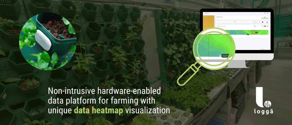
Data Heatmaps
Data visualization in the form of heatmaps empowers both technical and non-technical audiences to engage with, and understand important data insights quickly and effectively.

Data heatmap visualization provides a powerful combination of clarity, accessibility, and spatial and temporal context, making it the ideal tool for representing complex data such as temperature or humidity in a greenhouse:
1. Intuitive Representation
Heatmaps use color gradients to represent data values, making it easy for viewers to grasp complex information quickly. Warmer colors (like reds and oranges) can indicate higher values, while cooler colors (like blues and greens) represent lower values. This visual cue allows users to intuitively understand patterns and anomalies without needing to interpret raw numerical data.
When you have 100s of sensors in a greenhouse, you do not have time and/or skilled resources to look into 100s of individual graphs of data or endless tables, but it is easy, intuitive, and fast, to look at just 1 picture, which is essentially what a heatmap is, a picture.
2. Immediate Insights
With heatmaps, patterns that might be missed in tables or charts become immediately apparent. For instance, areas of high humidity or elevated temperatures can be quickly identified. This visual clarity helps in decision-making processes, such as identifying areas of the greenhouse that may need intervention (such as turning on fans, watering evaporative cooling pads, etc…).
3. Accessibility for Non-Technical Users
Heatmaps lower the barrier to entry for understanding data. Non-technical users can easily interpret the visual cues without needing extensive training in data analysis. This democratizes data access, allowing more people to engage in discussions based on the information presented, regardless of background, language or skill level. It perfectly fits the agricultural sector.
4. Spatial & Temporal Context
Heatmaps effectively convey spatial relationships and patterns. By visualizing data on a geographical map, users can see how values change across different areas, leading to better geospatial insights over time. For example, a heatmap of temperature variations can highlight sectors of constant high heat, which might then need to be more shaded.
Data loggers can also be applied at various vertical levels, so users can use data heatmaps to differentiate patterns and variations between ground level for example compared to a higher level (e.g. 8ft high, or even ceiling level). By seeing data heatmaps in a multileveled visualization of data, you can get a much better understanding of temperature and humidity flows within your greenhouse or your field, both horizontally and vertically.
5. Interactive Exploration
Users can zoom in on specific areas, and focus on a specific set of data. The heatmaps can be played just like a video, they can be paused, they can be slowed down or sped up, the time period can be narrowed down to a few hours or minutes, or expanded to a few months or years. Heatmaps really encourage deeper investigation and understanding, allowing users to explore data at their own pace and focus on areas of interest.
If you still have any questions or want to find out more about our unique heatmap feature, feel free to get in touch.
About Emertech
Emertech is an alumni of the Hong Kong Science & Technology Park (HKSTP) incubation programme and a member of the HKSTP Startups Alumni Association.
Get in Touch!
Units 45, 2/F
Shun Luen Factory
86 To Kwa Wan road
Kowloon
Hong Kong
Email: info@emertech.hk
![]()